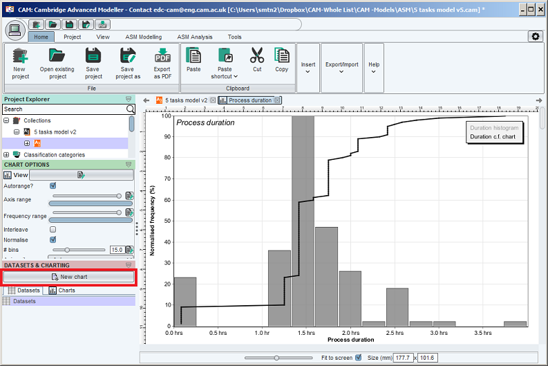
Creating new charts
To create a new chart after running simulations, click the New chart button in the datasets and charting tab (seen highlighted in the left-pane of the screenshot below).
Configuring charts
Each type of chart provides various options for configuration. These appear under the green bar labelled 'chart options' on the top-left of the screen. Additional chart options are available by clicking the 'all properties' button just under the green bar, when a chart window is visible. This button is highlighted in the screenshot below.
About layers in a chart
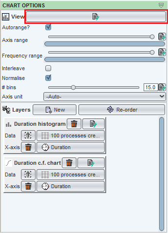
All types of chart have multiple 'layers'. A layer determines a set of data which will be plotted in the chart.
When a chart is created automatically, it usually has only one layer. Adding additional layers allows different datasets (or different values extracted from the same dataset) to be easily compared.
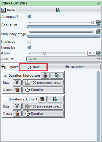
Creating and configuring layers in a chart
To create a new layer click the 'New' button, just to the right of the bold-face 'Layers' label in the 'Chart options' pane.
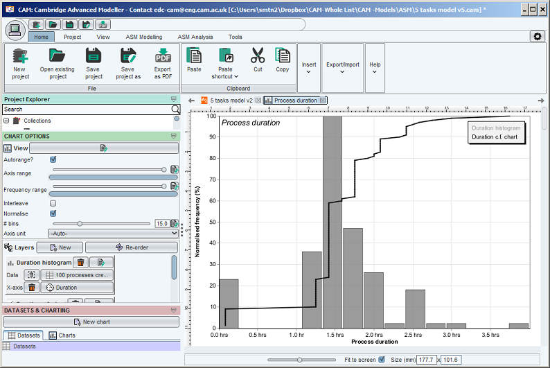
This will bring up a dialog which looks like the one shown below. The exact dialog will differ based on the type of chart; this example was taken from a 2D histogram generated as the default chart from an ASM simulation.
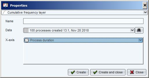
At the top of the dialog is an option to select the Layer type. Certain chart types, including the 2D histogram, provide the option to overlay different types of chart on the same axes. In this case, you can choose either a Cumulative frequency layer or a Histogram layer.
The most important parts of this dialog are the fields entitled Data and Value:
- Data refers to the simulation dataset which contains the information from which data will be drawn. The datasets listed are exactly the same as those shown in the Datasets tab of the Simulation resultsets and charting pane. The most recent dataset is always shown at the bottom of the list.
- Value refers to the particular information which will be extracted form the specified dataset and plotted.Different types of dataset generated through different simulation codes provide different sorts of value for plotting. Only those values supported by the selected dataset will be visible for selection. In the case of ASM simulation resultsets, a range of values, most notably Process duration are available. Some of these values also have further options which can be configured; for instance, Final value of a process variable requires selection of the variable whose final value will be plotted in the histogram
All the layers in a chart are listed in the 'Chart options' section on the top-left of the screen, and are plotted in the sequence they are listed (for instance, on a histogram the topmost layer in the list will be drawn first, and 'overlaid' by any subsequent layers.
To re-order the layers, click the 're-order' button which appears just to the right of the bold-face 'Layers' label in the 'Chart options' pane.
To reconfigure a layer once it has been created, click the All properties button next to the layer name, which is located in the Chart options pane. The rendering properties can be modified by clicking the 'Display' tab in the Layer Properties dialog for the rendering of the layer.
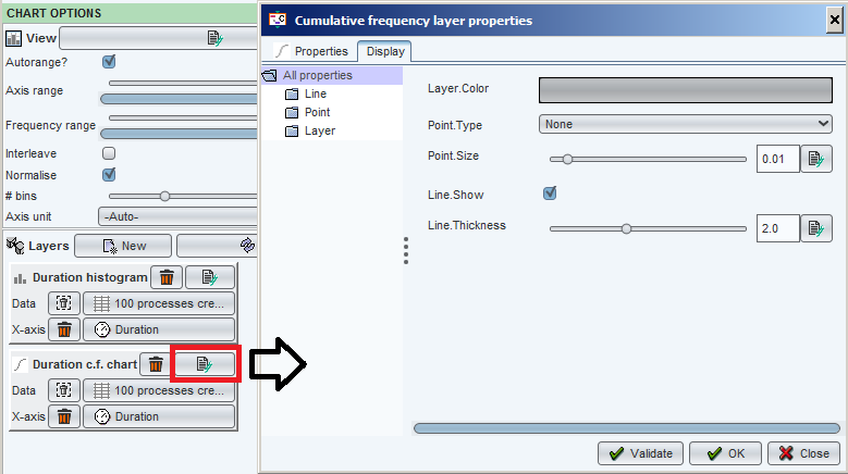
An example of a 2D histogram of ASM process duration, after adding and re-configuring a Cumulative frequency layer, is shown below
Setting the ranges of axes on a graph
Most types of graph have one or more numerical axes. By default, the ranges (minimum and maximum values) of these axes is determined automatically, by the extent of data which is plotted.
You may also wish to change these settings, eg. to 'zoom' on an area of interest in the data set. This is achieved using the controls labelled, eg. Axis range, which are visible on the chart options pane of most charts. For example, the figure below shows the two axis range sliders extracted from a cumulative frequency plot. In this case the top slider controls the X-axis of the plot; the second, the Y-axis. The labels of these controls may change according to the plot type and the number of axes on that plot.
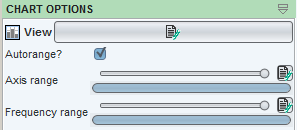
Considering the Axis range property, there are two range controls.
The uppermost slider bar (with the circular pointer) indicates the 'size' of the axis range. In this case, it is set to the maximum possible size - encompassing the whole dataset. Grabbing the circular pointer and moving it to the left will reduce the size of the range, effectively 'zooming in' on the corresponding axis.
The second slider bar indicates the position of the current view, relative to the total extent of the data. Moving the slider bar causes the corresponding axis to 'pan'. This control will change as the size slider is modified. In the figure above, it is not possible to pan the axis because the size of the range is set such that the entire dataset is visible.
Exact minimum and maximum values of the axis can be specified by clicking the small button to the right of the slider.